Analyze computational results using Python, Pandas and LaTeX
Introduction
Every researcher may use its own set of tools for analyzing the data of their experiments and computing statistics. Writing scripts to automatically compute and include tables in your article can make you save a lot of time. A great tool used by scientists is the R project. The latter is free software and a programming language designed for statistical analysis and graphics. I strongly recommend having a look at this tutorial if you want to learn how to use it. In this post, we will investigate another great programming language: Python. An advantage of Python over R is that it is extremely popular and even more general-purpose. Hence, it offers a huge number of libraries for almost every use case. In particular, we will use a well-known data analysis and manipulation tool: Pandas. This library can perform a lot of stuff, such as loading/saving data in various formats (CSV, Excel…), filtering, and computing numerous statistics. If you are not familiar with Python, there exist plenty of tutorials online, even interactive ones.
Preparing the data
Suppose we implemented three algorithms to solve a minimization problem. We run experiments on three instances. Let’s name our algorithms alice, bob, and carol, and our instances inst1, inst2, and inst3. For the sake of simplicity, we assume that our algorithms are run only once on each instance. We want to compare the algorithms in a beautiful LaTeX article. In particular, we would like to obtain for each algorithm the average and the maximum relative gaps with respect to the best-known solution, as well as the average computational times. To simplify, we stored the raw results in a single CSV file (data.csv) where each row contains the characteristics of a single run: instance, algorithm, obj (objective value), and time (computational time).
instance,algorithm,obj,time
inst1,alice,7,16
inst1,bob,16,19
inst1,carol,6,14
inst2,alice,2,11
inst2,bob,3,18
inst2,carol,15,17
inst3,alice,9,15
inst3,bob,17,10
inst3,carol,19,13
Loading the data
Now, the data analysis can start. We create a python script named analyze.py and load the CSV file.
# We need to import Pandas to use it
# Load the contents of "data.csv" in a DataFrame object
=
# Display the DataFrame object
The last instruction should display the following:
  instance algorithm  obj  time
0    inst1     alice    7    16
1    inst1       bob   16    19
2    inst1     carol    6    14
3    inst2     alice    2    11
4    inst2       bob    3    18
5    inst2     carol   15    17
6    inst3     alice    9    15
7    inst3       bob   17    10
8    inst3     carol   19    13
The contents of data.csv are stored in an object df of type DataFrame. This object offers powerful features to transform existing data or create new data. I recall that we want to compute the minimum/average relative gaps and the average computational times.
Computing new data
Best-known solution
First of all, let’s compute the best-known solution for each instance, required to compute the relative gaps. To do so, we group rows by instance and take the minimum obj value in each group, as follows:
# Obtain a Series object that contains the best-known solutions
=
Don’t panic, let’s decompose this instruction. First, df.groupby(“instance”) creates a GroupBy object. From the latter, we tell Pandas that we need only the obj column, so we use the […] operator. Finally, the .transform(…) method applies a function (min) on each group. It returns a Series filled with transformed values but the original shape is preserved. As a consequence, we can directly use the bks (best-known solution) variable as a new column for df, using the .assign(…) method.
# Add the "bks" column
=
# Display the updated DataFrame
We can observe that the column has been successfully added:
  instance algorithm  obj  time  bks
0    inst1     alice    7    16    6
1    inst1       bob   16    19    6
2    inst1     carol    6    14    6
3    inst2     alice    2    11    2
4    inst2       bob    3    18    2
5    inst2     carol   15    17    2
6    inst3     alice    9    15    9
7    inst3       bob   17    10    9
8    inst3     carol   19    13    9
Relative gap
Legit question: why did we add the bks column? Well, it is not mandatory but doing so makes it easy to compute our relative gap given by the formula: .assign(…), let’s do it in one line:
# Add the "gap" column
=
# Display the updated DataFrame
If obj can have a zero value, you need to adapt the formula (e.g. (df[“obj”] - df[“bks”]) / (df[“obj”] + 1)). In our case, the result is:
  instance algorithm  obj  time  bks       gap
0    inst1     alice    7    16    6  0.142857
1    inst1       bob   16    19    6  0.625000
2    inst1     carol    6    14    6  0.000000
3    inst2     alice    2    11    2  0.000000
4    inst2       bob    3    18    2  0.333333
5    inst2     carol   15    17    2  0.866667
6    inst3     alice    9    15    9  0.000000
7    inst3       bob   17    10    9  0.470588
8    inst3     carol   19    13    9  0.526316
Summarizing the results
We are ready to compute the average/maximum relative gap and the average computational time for each algorithm. First, group the rows by algorithm in a temporary variable df_g.
# Group by algorithm
=
Remember that the df_g is an object of type GroupBy. The GroupBy class offers handy methods to compute the most common statistics, in particular, .min(), .max(), and .mean(). We create a new DataFrame summarizing the results:
# Compute the average and the maximum gap, plus the average time
=
# Display the summary
Let’s decompose the previous code a little bit. We create a DataFrame from a dictionary where each element is a Series, thus df_summary will contain three columns. The df_g[“gap”].mean() instruction tells that we want to operate on the gap column only, then compute the average of gap in each group. We call .mul(100) to multiply values by 100, since they are percentages. Similarly, it is easy to understand the meaning of the other columns. See the contents of df_summary:
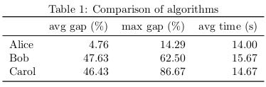
             avg_gap    max_gap   avg_time
algorithm
alice       4.761905  14.285714  14.000000
bob        47.630719  62.500000  15.666667
carol      46.432749  86.666667  14.666667
Looks pretty, isn’t it?
Output table
I know two ways of importing the table into a LaTeX article. One way is to call the .to_latex() method. This converts the table into a valid LaTeX code. The other way consists in saving the table to a CSV file (.to_csv()) and letting LaTeX processing it. Both approaches have their pros and their cons, depending on your case. If you need to reuse the same data for several outputs (e.g. a table and a figure), I recommend the second approach. Otherwise, the first approach is fine for common situations.
From Python
Let’s start using the .to_latex() method.
# Display the DataFrame in LaTeX format
# Export the DataFrame to a LaTeX file
This outputs the following LaTeX code.
Well, we require some modifications:
- Our algorithms are so great, we want to name them with a capital letter.
- Remove the row starting with
algorithm. - Rename the columns as
avg gap (%),max gap (%), andavg time (s). - All values need two decimals only.
Since the table is pretty small, we could just edit it by hand. But what if we had one hundred algorithms to compare? We can exploit Pandas to automatically post-process our table. First, change the name of the rows and columns. To do so, we use the .rename(…) method.
# Rename rows (indexes) and columns
Note that the inplace argument indicates the method should modify directly df_summary. Next, we format the values according to our needs. Through its formatters argument, .to_latex() allows us to apply a function on each column as follows.
# Export the DataFrame to LaTeX
Yeah! It provides the result I want. Yet, I think I can improve this Python script. In particular, I don’t like to copy-paste the transformed column names, because it means I need to edit them in several places in case I change my mind. Thus, I prefer to define the formatting using the original CSV column names (avg_gap, …). We can do this elegantly with the magic of dict comprehension:
=
=
=
# Rename rows (indexes) and columns
# Export the DataFrame to LaTeX
Finally, we set index_names=False to remove the algorithm row. Here we go! The content of summary.tex should be:
We can copy-paste this code into our LaTeX article. Personally, I prefer to save it as a separate file and use \input{summary}. Here is my LaTeX template:
\begin{document}
\begin{table}
\centering
\caption
\end{table}
\end{document}
From LaTeX
The previous method exports the table to ready-to-use LaTeX using Python. Whereas editing the table from Python is often handier than editing it from LaTeX, I still like the second approach. LaTeX has the ability to import CSV files thanks to packages such as csvsimple and pgfplotstable. One of the great advantages of using a CSV file is that we can use the latter as a single source of truth. Why this is an advantage? For example, we can display the same data simultaneously as a table and as a chart. In the following, we assume that our df_summary table has been unchanged (its columns are still named avg_gap, max_gap, and avg_time). Although we might be able to do it in LaTeX, we choose to rename the algorithm names in the Python script before exporting the table to summary.csv.
# Rename rows (indexes)
=
# Export the DataFrame to CSV
From now, we use pgfplotstable to load the CSV file. Our LaTeX article follows this template:
\pgfplotstableread[col sep=comma]
\begin{document}
\begin{table}
\centering
\caption
\pgfplotstabletypeset[<options...>]
\end{table}
\end{document}
The \pgfplotstableread command imports the CSV file to the \summarytable variable. Note that we need to specify col sep=comma, otherwise it is assumed that values are separated by white spaces. The \pgfplotstabletypeset command outputs a table from the \summarytable variable. All we need to do is to define the options to satisfy our requirements. Since there are plenty of them, we will go through them step by step.
First, we can specify which columns of the CSV file we are using. Although this is optional (we are using all the columns), I recommend doing so in the case we update our CSV file with more columns.
columns={algorithm, avg_gap, max_gap, avg_time},
Next, let’s format the column algorithm:
    columns/{algorithm}/.style={
            column name={},
            column type=l,
            string type},
We decided that the column algorithm has no name and its content is aligned to the left (l). We specified that this column contains strings, not numbers (otherwise it will raise an error). Similarly, we format the column avg_gap:
    columns/{avg_gap}/.style={
            column name={avg gap (\%)},
            column type=r,
            precision=2,
            fixed,
            fixed zerofill},
This time, we want the column to be aligned to the right (r). The precision argument determines the number of decimals to show. Moreover, the numbers should be in fixed notation and filled with zeros. Except for the column name, the options for max_gap and avg_time are identical. To make our table look pretty, we add some \toprule, \midrule, and \bottomrule.
    every head row/.style={before row=\toprule, after row=\midrule},
    every last row/.style={after row=\bottomrule},
Please find here the complete code of the table:
\begin{table}
\centering
\caption
\pgfplotstabletypeset[
columns=,
columns//.style=,
columns//.style=,
columns//.style=,
columns//.style=,
every head row/.style=,
every last row/.style=,
]
\end{table}
Previously, I said that we can display a chart using the same source data. This can be done by including the pgfplots package.
The following code creates a simple vertical bar chart embedded in a figure for the average gap.
\begin{figure}
\centering
\begin{tikzpicture}
\begin{axis}
\addplot table [x expr=\coordindex, y=];
\end{axis}
\end{tikzpicture}
\caption
\end{figure}
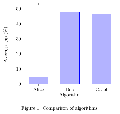
Commands and arguments of pgfplots are detailed in the manual. And voilà! We obtain both a table and a chart from a single source of data.
Conclusion
I described a method for computing statistics and creating LaTeX tables programmatically using Python and Pandas. We discussed two ways to include tables in a LaTeX article. Preparing such scripts can help saving time and avoiding mistakes, compared to writing values manually. Along with R, Pandas is a very mature and powerful library that is not limited to our use case. Check out the manual for more details.